Services
Industries

UX research and Product Design for ICB

ICB is an educational platform for learners eager to explore web3 technologies and development frameworks. Users can take courses at various levels, ranging from beginner to advanced, covering diverse disciplines—from general knowledge about web3 to the deep learning possibilities of progressive programming languages like Rust. ICB collaborates with numerous blockchain networks to educate users and has extensive experience in developing courses for top-tier blockchains such as Solana.

The IdeaSoft team played a key role in the technical product design, ICB brand strategy, and deep UX analysis of the target audience. This involvement contributed to shaping the platform’s identity and overall design approach.

Learn more about our Product Desing Services

image_main
Client ICB
Services Product design Branding
Technologies Figma Adobe Illustrator Adobe Photoshop Miro Adobe After Effects
Project Description

Project Overview

ICB stands for IdeaSoft Career Booster and is an educational platform dedicated to empowering learners with a comprehensive understanding of web3 technologies and development frameworks. The platform facilitates a progressive learning journey, offering courses tailored to various proficiency levels, ranging from beginner to advanced.

The conceptualization and realization of ICB’s vision stem from the combined expertise of both the IdeaSoft design team and the ICB product team. Our primary focus involved technical product design, intricately shaping the ICB brand strategy, and preparing a thorough UX analysis of the platform’s target audience.

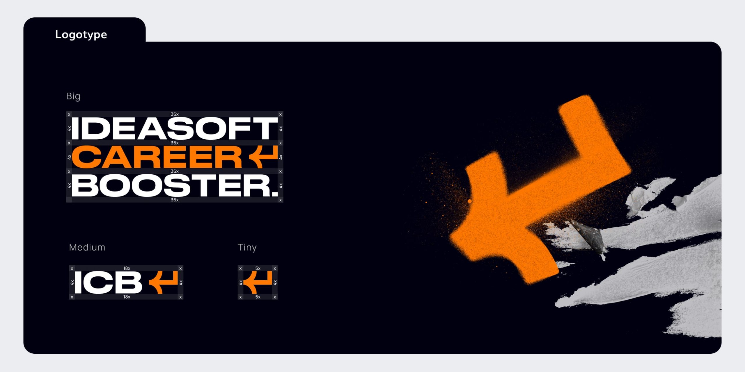
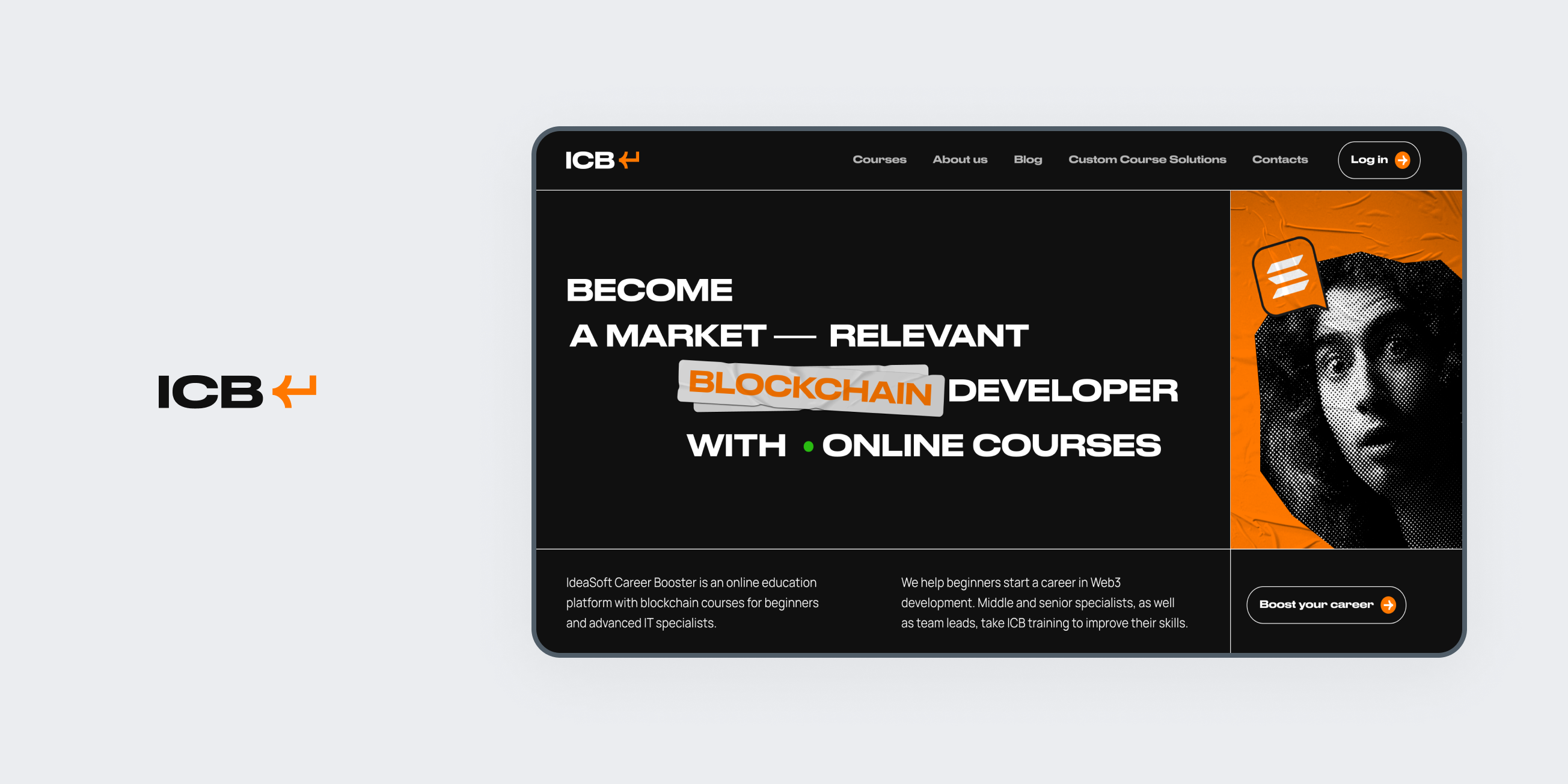
In terms of brand strategy, our emphasis was on defining the unique elements that distinguish ICB in the educational landscape, creating a brand identity that resonates with the product’s target audience and helps it stay competitive in the market. The main idea behind the branding concept was to create a scalable logo with short and long letter marks, also pictorial mark had to indicate growth and information uploading with a simple, minimalistic, and recognizable shape.

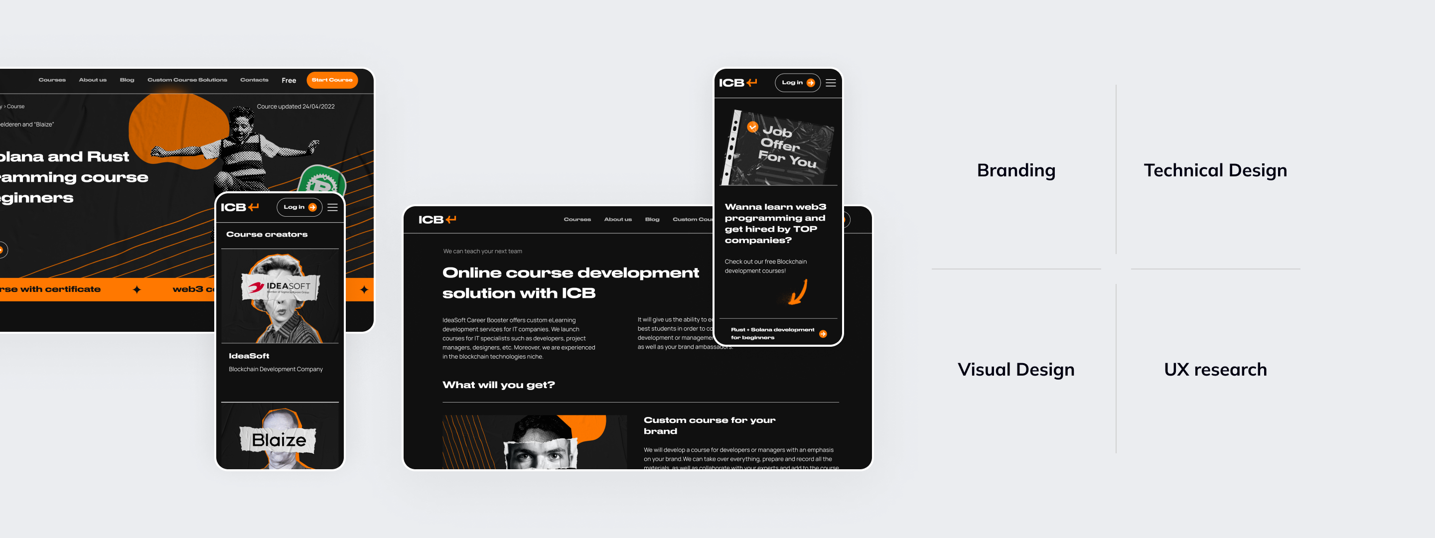
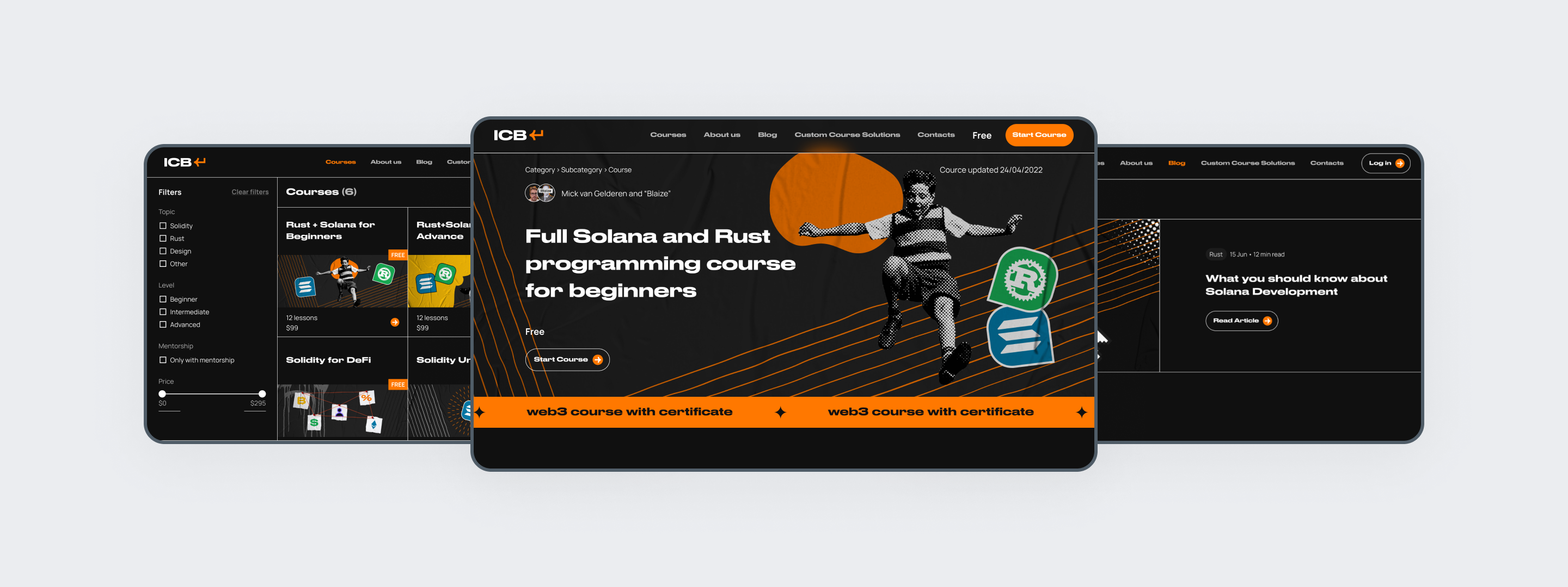
Simultaneously, the deep UX analysis delved into understanding user behavior, preferences, and pain points, contributing to the creation of an interface that not only aligns with educational goals but also guarantees a seamless and engaging experience for the platform’s users. After detailed UX research and target audience interviews, we decided to use a brutal style with an informal way to bring information to the end users. It also aligned perfectly with grotesque fonts, fresh colors, dark themes, and funny mixed-styles collages.

The collaborative efforts of IdeaSoft and ICB teams have yielded into platform identity and design approach that embodies the product’s dedication to providing an outstanding educational journey.
project_image_full
Target Audience

Target Audience

The project’s target audience encompasses a diverse spectrum of professionals:

— Middle and senior specialists;

— Team leaders / Heads of departments;

— Executives / Managing partners;

— Startup / Company owners.

The collective goal is to create a comprehensive and inclusive platform that resonates with professionals at various stages of their careers and across different organizational roles.

project_slider_2_image
Business Needs

Business Needs

  1. Develop a product that caters to the needs of both beginners in the blockchain field and professionals seeking to enhance their skills.
  2. Create a “unique” design that reflects the theme of the courses but at the same time avoids being overly used or clichéd.
Implemented Solution

Implemented Solution

  • Branding
  • User research & design
  • Visual design
Challenges

Challenges

  • One big design challenge we faced was how we usually look at references and other stuff for inspiration while designing. Usually, designers check out things that match both the look they want and the specific area of the product. But for us, we had to design an education platform in a style that no one had tried before. Instead of doing the usual thing and looking at other websites in the same field, we got creative.
  • We took ideas from cool, old concert posters, vinyl record covers, and even those cool aged photo collages. Basically, anything with a retro vibe. Mixing all these different things together helped us come up with the unique style that makes our product stand out.
Delivery Time

Delivery Time

3 months

Team Size

Team Size

10 team members

project_last_image
Testimonials

The design of our educational platform, which even impressed the top brass at Solana Foundation, stands out as truly distinctive. With its bold brutalism and expansive room for creativity, it seamlessly combines an interactive educational style within the web3 landscape. In essence, it's a perfect alignment with our audience, serving as a superb reflection of our unique tone of voice. The two courses we developed have not only met but exceeded expectations, and the design has played a pivotal role in bringing our vision to life.

Karina Ocheretiana Product Manager at ICB