Services
Industries

UI/UX Trends: Moving Beyond the Bento Box

Trends in UI/UX continue to evolve, take new forms, and find new uses for the user’s benefit. It’s also a race of products and designers – after all, if your design is user-friendly and accepted by the user with joy, you’ll be a sought-after project.

So, it pays to study trends and sometimes anticipate them to make a really cool product without a common Bento box web design approach. In this article, we discuss a list of UI/UX design trends you must be aware of to create awesome design projects.

Looking for an experienced UX design team?

Any UI/UX design trend can suit all types of websites and applications, but you must analyze whether they suit your tone of voice and brand image. Therefore, UI/UX style should be carefully created in order to align with your marketing and product strategy.

Need to create design concept for your new app? Or want to redesign the existing solution? Leave us a message and our tech specialist reach out with the most suitable offering and timings for you!

Table of Contents:

  1. Bento Box: A Foundation, Not a Finish Line
  2. Top UI/UX Trends to Watch for in 2024
    1. Voice User Interfaces
    2. Motion Design
    3. Bold Minimalism
    4. Micro-interactions
    5. Scrollytelling
    6. Dynamic Color Gradients
    7. Retro
  3. Why These UI/UX Trends Are Succeeding?
  4. IdeaSoft Experience
  5. Summary

Bento Box: A Foundation, Not a Finish Line

Bento in design is not a separate style but a way of presenting information in the form of rectangular and square cells (more often with rounded corners). In simple words, bento can be described as a combination of grids and cards.

The Bento box design trend borrows its orderliness from grids. This ordering can be in the form of columns or rows. Mixed variants are also available but are used less often in practice because they are less convenient for layout, scaling, and adaptation. A good designer always considers how the project will be designed and developed.

Bento takes from cards the idea that one cell contains one semantic unit. For example, a card in an online store contains information about one product.

Although bento allows you to present content in a more structured way, the hierarchy may suffer. Due to the size of cells, building it alone may not be enough. It is necessary to additionally manage the user’s attention through color, typography, and illustrations. The geometric basis of bento is quite versatile—it can be combined with any style (minimalism, 3D, neo-brutalism, and so on).

Design is not a set of strict rules, and there can be exceptions. Bento heads UI/UX design trends 2024. It is simple to use and execute. It is clear enough for the user. If a bento box can be appropriately incorporated into your design, use it. Most importantly, don’t do a bento just because it’s a trending UX design.

Anastasiia Lisova, Senior UI/UX designer at IdeaSoft

When Should You Consider A Bento Box For Your Project?

Bento box will fit well on a site with a lot of equally important information, more specifically:

  • To list product features and characteristics
  • To present a gallery or previews of articles with titles
  • To design a small number of product cards (as a rule, not on large marketplaces)
  • To design dashboards

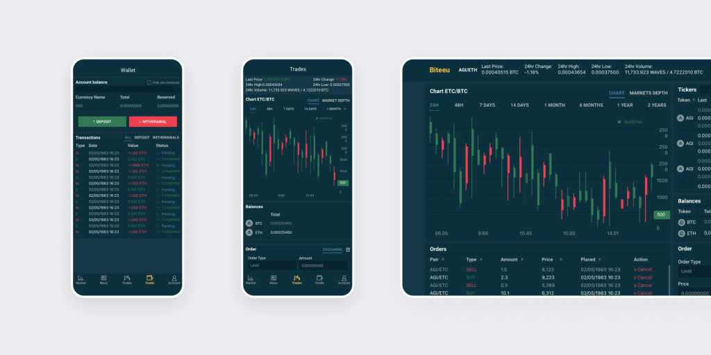
Bento is not suitable for content that needs a strict hierarchy. If you work on Web3 project design, we already have discussed UI/UX design best practices for crypto app development.

Top UI/UX Trends to Watch for in 2024

What does our Senior UI/UX designer think about the latest UI/UX design trends?

Retro vibe, brutalism, bold minimalism, micro-interactions… All these trends are awesome. However, I think it is most important to design differently now. It shouldn’t look like the designs of competitors. Still, it must be usable. Complex interfaces must consider patterns of user behavior.

Senior UI/UX designer Andrii Mitrokhin

Now, it is time to discuss the latest trends in UI/UX design!

Voice User Interfaces (VUIs)

Designing voice user interfaces (VUIs) involves integrating voice-based interactions to create seamless, hands-free experiences. This UX design trend allows users to interact with digital systems through voice commands, enabling devices to comprehend spoken language and respond appropriately.

Voice interfaces go beyond simple voice recognition by interpreting natural language, facilitating smooth interactions across various platforms. This design approach enhances accessibility and convenience, especially for multitasking or supporting users with physical limitations. 

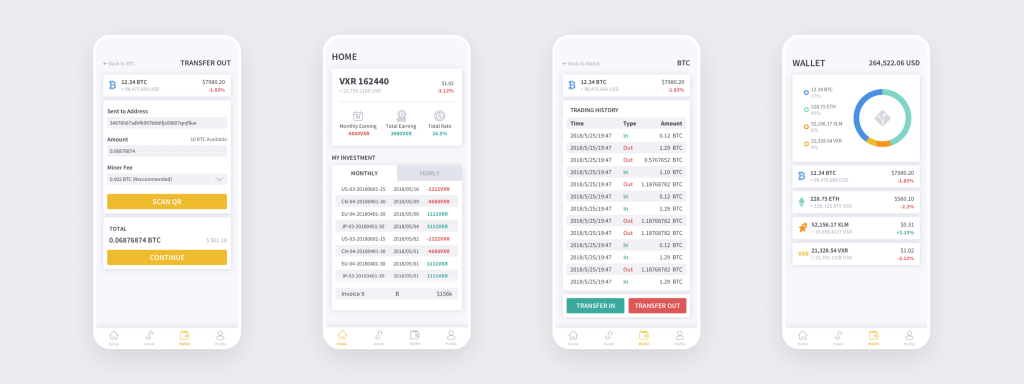
You can also read our UX design tips to improve conversion of your web app.

Motion Design

Thanks to technical progress, motion design is becoming an integral part of interface design. Previously, it was not an affordable luxury for everyone because “animating” elements was a long and expensive process. The result could slow down pages a lot. 

But now, animation and video compression development allows you to work faster and produce results that do not threaten speed and efficiency. And the devices themselves can easily pull quite complex effects, even standard smartphones, not to mention top models and PCs.

In sum, this leap in development has made it possible to create more complex and detailed motion in interfaces. This helps designers achieve greater dynamism and visual appeal in a project, make immersive elements, and add new nuances of interactivity.

This latest trend in UI design suggests that motion design will soon become integral to pages and apps for any purpose.

Bold Minimalism

New trends in UI/UX design lead to elements becoming simpler both to use and to perceive. And, consequently, simpler visually. Now, you don’t need unnecessary non-functional decor. Ornate patterns and distracting palettes are removed, and everything becomes extremely concise. And therein lies a new trend in aesthetics. We see this not only in web design – the world of interiors is being taken over by restrained Scandi, and fine art gravitates more towards conceptuality than visual noise.

For web design, flat elements and patterns, simple navigation, and a limited color palette are now more acceptable. While thoughtfulness in every detail is welcome, it should have its own function and necessity on the page. 

Micro-interactions

There is an increasing emphasis on micro-interactions. These relate to decisions that are often made later in the design project. But many things are worth thinking about in advance. If done correctly, micro-interactions can even become the product’s main feature.

Small, detailed animations, transitions, and reactions are designed to improve the user’s perception of the interaction process and make it more pleasant, functional, and intuitive. These can be:

  • Animated transitions between screens or pages
  • Animation of interface elements on hover or touch to emphasize interactive elements
  • Loading and waiting animations that let users realize that something is going on behind the scenes
  • Animated icons and symbols that visually convey information or action
  • Animated notifications and tooltips
  • Animated forms and input fields to make the data entry process more interesting and intuitive

Micro-interactions are important because they improve the overall perception of the user interface, make it more attractive, and help better understand how to interact with the application or website. They can also increase user satisfaction and engagement.

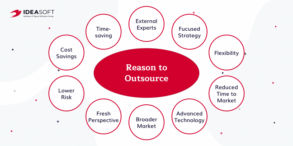
If you want top-notch design for your project, you can outsource UX design to experts, who will deliver an even better result than you expected.

Scrollytelling

Scrollytelling or immersive scrolling is scrolling animation on the page. The word “immersive” is more often used in the context of the game industry. But in design, it is also applicable. Sometimes, you can forget about everything and spend literally hours on some website. And it’s not always because of the usefulness of the information. It’s just that the site or app is addictive. You’re there completely. This is an example of high immersion.

With the right approach, this UI/UX design trend provides visual appeal and spectacular transitions between different elements. It’s not so much about usefulness and convenience. It is about presenting information more smoothly, simplifying perception, and making the user experience a little more pleasant. Doing so increases user loyalty to the brand, keeps them on the page, and increases traffic. 

Immersive scrolling capabilities can bring products to life and make a simple page more cohesive and aesthetically pleasing.

Dynamic Color Gradients

Gradients have been a staple in design for years. They are poised to reach new heights in UI trends 2024. Traditionally, designers have used gradients for headers, backgrounds, logos, and text, leveraging their ability to blend colors and add depth to a design.

The latest advancements in dynamic effects and UI design software offer even more opportunities to push the boundaries of visual perception. Designers are now experimenting with diverse color schemes and seamless transitions between hues to create a sense of expansion and movement. Gradients also enable the creation of unique styles that align with a brand’s vision and specific project goals.

Retro

Retro trend ends our list of UI/UX design trends. Some palettes trigger the release of dopamine: warm, soft shades, more often of the yellow-orange spectrum. Combined with soft textures and rounded shapes, the use of a “happy palette” often fits perfectly with retro style. And that’s a double benefit. First, warm colors already evoke comfort and coziness. Secondly, we play on nostalgia for an older audience and retro-style fashion for younger users. 

This UI design trend is a powerful game-changer in 2024. Retro elements can be combined with contrasting brutal details to produce a bold, unusual design that will still be perceived as positive and heartwarming.

Why These UI/UX Trends Are Succeeding

New trends in UI/UX design are succeeding because they integrate advanced technologies like voice user interfaces more effectively than Bento UI. UI/UX design trends cater to user expectations by offering highly tailored, immersive, and intuitive experiences that align with contemporary aesthetic preferences, such as minimalistic design and dynamic, interactive elements.

Enhanced functionality, achieved through seamless integration of these technologies, ensures a smoother, more engaging user journey. It addresses the demand for efficiency and convenience.

IdeaSoft Experience

At IdeaSoft, we have a professional design team dedicated to your success. Our design projects are published on our official Behance page. Many of them are made with the latest UI trends 2024 in mind.

Our designers have created a comprehensive design kit (versatile template) that is now available for public download. You can use it to create or refine your designs— free of charge.

Click here to download it

Design for ICB

ICB is an educational platform for learners eager to explore Web3 technologies and development frameworks. We at IdeaSoft developed a product that caters to both beginners in the blockchain field and professionals looking to enhance their skills. A distinctive design was created with brutalism and grid trends in mind. They reflect the theme of the courses while avoiding overused or clichéd elements.

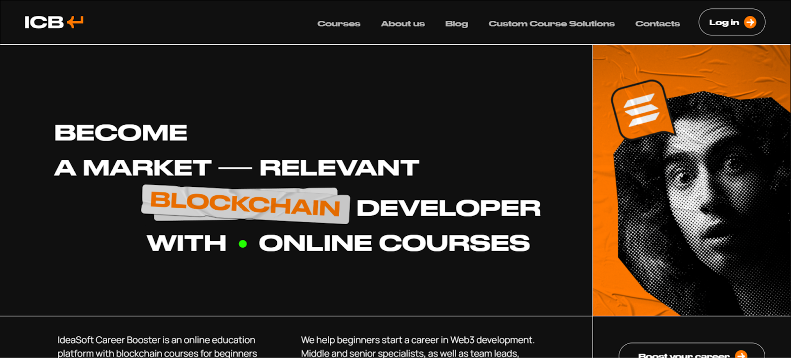
A significant design challenge we encountered was the typical approach of seeking inspiration from existing references. Instead of following the usual route and examining other educational websites, we sought inspiration from unconventional sources. We drew ideas from vintage concert posters, vinyl record covers, and retro photo collages. This blend of diverse, retro influences allowed us to develop a distinctive style that sets our product apart.

See Related Case

ICB Case Study

Design for European Digital Art Fair

We have one more completed project design that follows the latest trends in UI/UX design. The European Digital Art Fair (EDAF) was a fair that synchronized contemporary digital art and aimed to create a favorable global digital art ecosystem and art market.

An elegant design was created with kinetic typography and algorithmic grid UX design trend in mind. These trends reflected the innovations this fair brought to modern artists. By combining these trends, we have succeeded in creating a design on the edge of the progressive future and modernity.

See Related Case

You can check EDAF design on IdeaSoft Behance.

The Bottom Line

Trends in UI/UX are evolving, with new tools and demands constantly emerging. In addition to meeting current user needs, UI/UX designers are tasked with anticipating and closing new pain points and user expectations. Keep an eye on the latest UI/UX design trends, implement them, and follow the industry giants. And don’t hesitate to go beyond to make human interaction with the digital environment even better and more convenient.

Feel free to contact us if you need top-notch UI/UX design services!

UI/UX tricks for better dApp user conversions

In today’s tech landscape, the journey doesn’t end with launching a product; it’s just the beginning. As a tech provider deeply invested in our clients’ success, we’ve witnessed a shift in priorities. Many of our longstanding Web3 partners now grapple with the challenge of retaining users and enhancing their experience in an increasingly competitive arena.

Take niches like crypto wallets or DeFi platforms, for example. These are saturated markets where standing out is crucial. It’s not just about offering a product. For our IdeaSoft team,  developing UI/UX for crypto wallet is about waging a battle for user attention and loyalty. One way to achieve this is by leveraging the power of bento UI, a flexible and user-friendly interface design system that enhances the overall user experience.

Recognizing this paradigm shift, we’re pioneering a new approach: crafting UX-optimized pages that transcend traditional platforms. By focusing on enhancing user experience to improve conversion, we empower our clients to thrive in relentless competition.

Backed by a seasoned design team with years of experience, including specialists immersed in Web3 UX for over 7 years, we bring unparalleled expertise to every project. It’s not just about creating websites. It’s about shaping digital experiences that captivate and convert.

Our article will discuss how to increase user engagement with UX and top UX design tips to improve website conversions.

UX and CX are the top priorities for web3 and fintech platforms in 2024! Why?

As our partners and lasting clients navigate the ever-evolving landscape, the focus shifts to retaining users and elevating their journey within a fiercely competitive environment. Meeting this challenge demands unconventional strategies and a commitment to continuous enhancement of the customer experience within your application. Our design team has over 7 years of expetise in web3 niche and knows how to tackle these demands head-on, ensuring that your platform remains engaging and compelling amidst the intensifying competition.

Table of contents:

  1. Understanding UX and Its Impact on dApp Users
  2. 12 Key Principles of UX Design for Conversion Optimisation
  3. 3 Practical UX Design Tips for Boosting Website Conversions
  4. How to Measure the Impact of UX on Conversion Rate
  5. Summary

Understanding UX and Its Impact on dApp Users

UX design is the process of developing products (websites, apps, programs) that are useful, easy to use, and pleasant to interact with. In other words, it is the design of systems that should lead the user from the starting point to the endpoint by the shortest route and without difficulty.

UX design means the intersection of programming, design, and testing. The scope of work may vary depending on the specifics of the Web3 solution, but they often include the following:

  • User research
  • Character creation
  • Developing wireframes and interactive prototypes
  • Design testing

Conversion optimization with dapp development, UX must advocate for users and put their needs at the center of all design and development efforts.

12 Key Principles of UX Design for Conversion Optimisation

Drawing from the expertise of our Senior UI/UX designer, Anastasiia Lisova, let’s delve into the 12 key principles of Web3 product UX:

  1. Text contrast for accessibility. Ensuring optimal text contrast is not just about aesthetics but also about accessibility. Anastasiia utilizes tools like A11y Color Contrast Checker to guarantee readability for all users. At the same time, the main text size should be at least 16px for desktop and 14px for mobile screens.
  2. Minimalism in design. Every element on the screen should serve a purpose. Eliminate unnecessary distractions to avoid clutter. By keeping the interface clean, users can focus on what truly matters, enhancing their overall experience.
  3. Familiar patterns for seamless interaction. Leverage existing user patterns to reduce cognitive load. Users can effortlessly navigate through the Web3 interface by incorporating familiar design elements, leading to higher engagement and conversion rates.
  4. Strategic color usage. Limit the color palette to one accent color for primary actions and one secondary color. Avoid using pure black (#00000) and opt for shades to maintain visual harmony. This not only enhances aesthetics but also guides users towards key interactions.
  5. Deliberate button design. Design destructive buttons such as cancel, exit, or delete with caution. Require users to click on them deliberately to prevent accidental actions. Incorporate additional confirmation prompts before executing destructive actions to prioritize user control and safety.
  6. Typography for clarity. Choose simple and concise fonts like Nunito Sans, DM Sans, Inter, or Source Sans for the main text. Clarity in typography enhances readability, ensuring that users can effortlessly consume content.
  7. Error handling with guidance. When errors occur, provide users with actionable solutions rather than just displaying generic error messages. Offer clear guidance on how to rectify the issue, fostering a sense of empowerment and reducing user frustration.
  8. Multi-sensory information design. Avoid relying solely on color to convey information, as it excludes users with color blindness. Incorporate alternative cues, such as icons or textual indicators, to ensure inclusivity and accessibility for all users.
  9. Spacing for visual hierarchy. Maintain adequate spacing between elements to prevent clutter and enhance visual hierarchy. Well-defined spacing creates breathing room, improving overall readability and comprehension.
  10. Feedback through loading states. Implement loading states to signify system responsiveness, especially for actions with delayed responses. Visual feedback assures users that their interactions are acknowledged, enhancing their sense of control and understanding.
  11. Consistency in iconography. Maintain uniformity in iconography by using the same line thickness across all icons. Consistency fosters familiarity, making it easier for users to interpret and interact with interface elements.
  12. Progress indicators for guidance. Incorporate progress bars for actions that involve multiple steps. Progress indicators offer users transparency regarding their current position in the process, reducing ambiguity and improving task completion rates.

In contrast, such approaches as thin fonts, large headers at the top of the page, low text contrast, auto-scrolling, and carousel slider on the home page may become the great disadvantage for your platform or dApp UX. 

Anastasiia Lisova, Senior UI/UX Designer at IdeaSoft

Use these UX design hacks to improve website conversions. They have helped our team build dozens of Web3 products that drive the best user journey for our clients.

3 Practical UX Design Tips for Boosting Website Conversions

Here are 3 practical tips to improve conversion rate with UX design.

Use a clear CTA button

A call to action (CTA) is a button used on a website to motivate users to take a specific action. The most common and effective CTAs are: “Download a trial”, “Sign up for updates”, “Download an app”, “Book a consultation”, and many others.

Using a clear and attractive call to action button improves the user’s interaction with the website. This attribute should be located on every page of the website. Statistics confirm that resources with clear CTAs have higher conversion rates.

Besides, having clear wording for such a call to action significantly improves the overall user interaction. But do not forget, the button will work only if it is located in a prominent place on the page and attracts his or her attention with its design and content. Therefore, creating a new website or redesigning the current site, take into account the following points:

  • Varying the color of the CTA plays a significant role in its effectiveness. Use colors for this button that contrast with the color scheme of the entire web page.
  • Orient the text of the CTA to specific actions. Avoid using passive verbs. The text should be subtle and unobtrusive but active enough to encourage the user to perform the proposed action.
  • Content of the CTA should be as concise as possible – no more than 5 words.

Thus, in website UX design, a clear and visible call to action is a prerequisite for effective interaction between the site and the user. If you need a reliable UX/UI partner, we at IdeaSoft know how to design Web3 app as well as have experience in redesigning UX for conversion optimization.

Eliminate your 404 errors

If, as a result of the search, the visitor gets an error (in most cases, it is a 404 error), he or she simply goes to another site in search of a faster service. In other words, you lose a potential user. How to avoid this:

  • First, find out for which queries 404 errors are displayed and fix them as soon as possible.
  • Instead of letting your site go to the standard “Error 404: page cannot be displayed” page, customize error messages so that users find them friendly and attractive.
  • Use engaging images and create a pleasant background on the error page to reduce annoyance and smooth out the user’s inconvenience.
  • Try to take advantage of this situation. Based on your website’s specifics, offer the visitor the option to go to the main page, use the search function, read the promotions, or just entertain him or her.

Unfortunately, it is almost impossible to completely eliminate error messages. Still, you can turn this drawback in your favor, and timely identification and elimination of such defects will bring your resource site to the ideal UX.

Use authentic images

Authentic design is about creating something unique to your brand, avoiding replication or imitation of competitors. It’s crucial that your design not only reflects your brand’s unique selling proposition (USP) but also resonates with your target audience. This approach requires a foundation in thorough user research and understanding of your audience.

By aligning your design with your USP and audience preferences, it becomes a powerful tool in attracting and engaging customers from the very first click. This strategic approach ensures that your design acts as a compelling call-to-action, enticing visitors and driving website conversions.

How to Measure the Impact of UX on Conversion Rate

IdeaSoft design team recommends to use a structured approach to measure the impact of UX on conversion rate:

  1. Analytics tools. Utilize analytics tools like Google Analytics, Hotjar, or Mixpanel to track user behavior on your platform or dApp. Pay attention to metrics such as page views, time on page, and user flow to identify areas of improvement.
  2. A/B testing. Implement A/B tests to compare different versions of your UX design to improve website conversions. Test variations in layout, color schemes, call-to-action (CTA) placement, and other design elements.
  3. Heatmaps. Use heatmapping tools like Plerdy to visualize where users click, scroll, or hover on your website. Heatmaps provide valuable insights into user engagement and can highlight areas for UX optimization.
  4. Benchmarking. Compare your conversion rate and UX metrics against industry benchmarks or competitors. This provides context and helps set realistic goals for improvement.
  5. Iterative improvement. Continuously iterate on your UX design based on the insights gathered from the above methods. Monitor how these changes impact conversion rate over time and adjust your strategy accordingly.

Related Post

If you are wondering what is better: outsource UX or in-house, we have prepared an article for you.

Summary

Remember, the key lies in continuous testing, analysis, and adaptation to ensure that the website evolves alongside user needs and preferences. With these UX conversion optimisation tips in mind, you can create seamless digital experiences that drive higher conversions and foster lasting customer satisfaction and loyalty.

How to Design Web 3.0 App

Having a robust, functional, and user-friendly application is one of the key points of any project’s success, especially in such a competitive niche as web 3.0 development. Surely, the decentralized nature of the web 3.0 apps provides users with a wide range of benefits compared to other solutions, such as greater privacy, enhanced content ownership, and advanced functionality. Nevertheless, if these provide a poor user experience, such projects will never get recognition among large audiences. 

Whether you decide to create a third-gen web solution from scratch or improve your existing products, the web 3.0 UX must be among your top priorities. In this post, our best dev specialists from IdeaSoft introduce the basics of web 3.0 app design that can help your project to succeed. We explain the core design principles and development stages and uncover the common tools and techniques which can provide your web 3.0 solution with powerful and competitive advantages. 

Table of content:

  1. Understanding Web 3.0 App Design Principles: Why These Matter
  2. Stage 1: Getting Started with Web 3.0 App Design
  3. Stage 2: web 3.0 App Design & Development
  4. Stage 3: Testing & Reviewing a Web 3.0 App Design
  5. Web 3.0 App Design Tools That Might Come In Handy
  6. How Much Does a Web 3.0 App Design Cost?
  7. Summary

Understanding Web 3.0 App Design Principles: Why These Matter

Recently, we’ve discussed what makes web 3.0 technology stand out compared to earlier generations and the role of blockchain in web 3.0. However, there’s another essential aspect to consider in third-gen web solutions: product design. 

The architecture of web 3.0 projects features a wide range of differences compared to regular web 2.0 applications. To come up with a powerful and user-centric decentralized app, it’s essential to run comprehensive market research, analyze clients’ pains and needs, and review the existing solutions provided by competitors. So, make sure your app designers have a deeper understanding of complex app architecture and solutions based on competitor research and product analysis. Finally, keep your web 3.0 application design simple and easy-to-navigate to help users better understand the interface and functionality provided.

Reducing the learning curve of web 3.0 is another emerging challenge in designing web 3.0 apps. web 3.0 architects should apply familiar patterns (for instance, through storytelling and commonly known design solutions), so the product looks more accessible and trustable for different audiences.

Ann Datsenko, COO IdeaSoft

Awareness of these simple principles helps businesses develop the most efficient, functional, yet simple platforms that fit their goals and their audience expectations.

Stage 1: Getting Started with Web 3.0 App Design

Once you realize the importance of user experience in Web 3.0, the next question that usually comes to mind is how to design a web 3.0 application. In fact, the design concepts aren’t solely based on the product vision and should be also created with the end user in mind. 

IdeaSoft’s best experts uncover the most valuable recommendations for creating a solid and user-friendly web 3.0 design. 

#1 Set the Goals

Identifying the clear goals of your future web 3.0 application is a classic yet extremely effective approach to shaping the reference and coming up with the most winning decisions during the planning and development stages. 

Some of the common questions that will add more clarity to your web 3.0 design:

  1. What’s the core goal of your web 3.0 application? 
  2. What pain/problem does your app target? What solution does it offer?
  3. What are the core functions of this product? 
  4. What makes your web 3.0 app stand out among competitors? Why is it appealing to users?
  5. What benefits do you expect to get from the business point of view? 

Once you write out the answers – you’re good to go with planning the details of your upcoming web 3.0 app project.

#2 Make a Plan

Based on the insights from the questions above, dig slightly deeper into the product’s vision to sketch out an outline of your web 3.0 application. 

Turning the ideas into a particular feature or design characteristic of your product becomes even easier with the right development team. For instance, at IdeaSoft, we help our clients to draw a visible roadmap of your web 3.0 app delivery while keeping in mind the business goals, audience needs, and market trends. Additionally, our dedicated development team can assist with app monetization, web 3.0 design, and marketing aspects to ensure the long-term success of your product. 

#3 Know Your Competitors & Target Niche

The more attention you dedicate to the research, the higher the chances to succeed. Knowing your competitors and their strong and weak points is an excellent approach to building a solid, functional and user-friendly web 3.0 design. What is more, this approach gives an excellent boost to your product’s competitiveness, allowing you to faster achieve the top positions within the target niche. 

IdeaSoft’s web 3.0 developers also recommend exploring the client reviews of your competitors. It’s one of the most effective ways to explore the current customer pains and can provide you with valuable insights on the key features to include in your web 3.0 product design. 

Stage 2: web 3.0 App Design & Development

Now, based on your product requirements and market needs, it’s time to create a web 3.0 startup. This implies turning the product’s vision and visualization concepts into the “spine” of your future app. 

Wireframing & Prototyping

Digital wireframing is one of the easiest and fastest ways to put your product ideas into the web 3.0 app interface. Basically, it lays out the basic pages and core functionality of your app design. Along with that, it’s extremely helpful for understanding how your app’s going to work and can greatly streamline the MVP development. 

Don’t try to make design for a web 3.0 app perfect from the first attempt. Instead, focus on as many implementation options as you need. This will help you to achieve the most relevant solution that delivers a high-end experience to the app users. 

UI/UX blockchain wallet design for Versara

See Related Case

Versara case study

Implementing User-Interface Design

Another crucial stage of web 3.0 app design basics is the UI design. To make your product succeed,  make sure your app is great-looking, professional and attractive while keeping it simple and functional.

Basically, that’s where the expertise of professional UI/UX designers comes in: they combine branding and product guidelines with the best practices in app design to make your web 3.0 solution recognizable and easy to use.

Additionally, a professional web 3.0 designer will help to integrate your product vision, requirements and preferences into the mockups and application as well, ensuring it’s still easy to navigate, simple and consistent. 

Incorporating Web 3.0 Elements and Interactions

When planning the design of your web 3.0 application, don’t forget to cover the technical specifications of the web 3.0 elements: blockchains, smart contracts, NFTs, crypto and other technologies. Depending on the specifications of your app’s infrastructure, web 3.0 designers can identify the most efficient implementation approaches to maximize the app’s performance from the business and client’s perspectives. 

For instance, the dedicated design experts at IdeaSoft always choose the web 3.0 elements and tools based on the project’s technical specifications and business needs. 

UI/UX CEX design for Biteeu

See Related Case

Biteeu case study

Stage 3: Testing & Reviewing a Web 3.0 App Design

Having finalized the UI design of your application with all the web 3.0 integrations covered, it’s now time to test the usability on real users. A rendered click-through model of your app can help you analyze UX in web 3.0, including the navigation, interface design, and functionality integrations coming during the development stage. 

Based on the extensive expertise from our recent projects, IdeaSoft experts suggest checking the UI/UX flow of your web 3.0 app design alongside Q&A testing and combining those two stages. Thus you will have an extensive overview and deep check of your app from various perspectives that help you imitate the real user interaction with your product. 

We underline the following steps for tests: 

  • Functional testing – comprehensive checkup of all the interactive elements of your app, such as form fields, buttons, links, screens and other interactions. 
  • Responsive design evaluation – ensuring that your web 3.0 app adjusts to different screen sizes and devices while remaining consistent and user-friendly. 
  • User flow checkup – understanding the navigation paths of your end-users, making sure they’re simple, logical and intuitive, yet remove any confusing dead-ends within the app. 
  • Web 3.0 elements performance testing – a detailed usability checkup of your application’s key web 3.0 elements (wallet connections, smart contract interactions, crypto transactions and any other blockchain-related components). 
  • Accessibility compliance testing – making sure the app can adapt to the personalized needs of your audience (for instance, keyboard navigation and screen reader compatibility). 
  • Performance review – accessing the design’s performance and loading times, checking for the optimization opportunities and design flaws that may cause loading or lagging user experience. 

Once the app’s UI design audit is completed, you’re all set to build the powerful and competitive web 3.0 product! Additionally, focusing on UX for conversion optimization will ensure that your app not only attracts users but also effectively converts them into loyal customers.

Thinking of launching your web 3.0 product?

Let us help you figure things out, and correctly draw up the requirements for your project

Web 3.0 App Design Tools That Might Come In Handy

At IdeaSoft, we’re constantly exploring new tools and platforms to come up with the most effective web 3.0 application design for your project. For each of our projects, our team creates a personalized set of development tools with the most relevant functionality that can increase usability while saving design time and cost. 

Below, our design team has introduced the basic list of tools actively used for web 3.0 app creation today. 

FigmaA collaborative design tool with similar functionality to Sketch and Adobe XD. Alongside a  large set of tools for app design prototyping, it features a real-time collaboration – an exceptionally helpful feature for teams responsible for different aspects of app design.
Sketch / Adobe XDBoth are quite popular general-purpose design tools that allow you to create wireframes, mockups, and prototypes for intuitive and efficient user interfaces. No matter how complex your web 3.0 solution is, these tools are necessary for designing the app’s general layout and basic user interactions.
Adobe Creative CloudAn excellent design tool for creating custom illustrations, icons, and animations, which can come in handy for designing your custom dApp.
SplineA useful 3D software for real-time collaboration that enables creating objects, and editing 3D materials and renders to enhance product interactiveness.
FlowMapA must-have design solution that helps creators to streamline customer journey mapping, user flow designing, prototyping, flowchart creation, and other processes within a single platform.
MazeAnother great tool for enhancing the product research workflow through continuous user insights and helpful data-driven analytics.
Popular Tools for Web 3.0 App Design, Source: IdeaSoft team

Having knowledge of blockchain networks, NFTs, and smart contracts is crucial for designing user-friendly decentralized applications. With this expertise, designers can efficiently test wireframes, reduce onboarding time, and minimize design costs by getting things right the first time without the need for rework. Our designers are well-versed in web 3.0 specifications and utilize web 3.0 tools effectively in their work. Some popular tools include: 

  • Truffle Suite: A popular development framework for building Ethereum-based dApps, the functionalities of which can help you design UX around the technical constraints and architecture of your web 3.0 application.
  • 3MetaMask Snaps: A library for integrating third-party plugins into the MetaMask wallet, which enables developers and designers to create custom user interfaces for blockchain interactions.
  • Fleek Space: A functional environment designed for building user interfaces for IPFS (InterPlanetary File System) and decentralized storage applications.

Along with the list of tools for web 3.0 app design, you’ll also need a good understanding of the basic blockchain concepts, app architecture and user behaviors to create a unique and functional dApp within this niche.

Once we review all the specifications of your web 3.0 solution, our development team will provide you with the list of the most efficient tools for the app’s design, development and deployment. Additionally, we will guide you through the key stages of the web 3.0 app design to help you create a robust, intuitive and highly engaging solution for your decentralized software. 

How Much Does a Web 3.0 App Design Cost?

Along with discovering how to design web 3.0 apps, business owners also ask about the overall cost of the design solution for their project.

According to the expertise of our previous web 3.0 projects, such as crypto exchange solution (Biiteeu), trade finance platform (Versara), and NFT marketplace (Nfinity), the cost estimations of the web 3.0 design are always individual. 

In most cases, the cost of a web 3.0 app design will vary depending on the blockchain technologies and expertise required, the size of your team, the project’s scale, and the timelines set. For instance, IdeaSoft’s specialists analyze each of these factors in detail to come up with a cost estimation plan that helps you to deliver a powerful web 3.0 product without sacrificing its quality or functionality. This approach ensures you can optimize Web3 development costs effectively.

Summary

With more and more web 3.0 solutions coming, product design and usability will gradually become the top priority for business owners. Wrapping the unique features of your web 3.0 application into the right design concept will help your business to improve the product’s accessibility and performance, access larger audiences and gain more trust from its users.  

At IdeaSoft, our developers feature extensive expertise in designing web 3.0 applications according to the novel approaches and most recent trends within the industry to ensure your product’s success. Whether you need a DeFi, digital wallet, exchange platform, Bento UI or any other blockchain-based dApp solution, we’re always to provide you with the top expertise, tools and techniques in web 3.0 design!

Contact us today and create the powerful web 3.0 app design that fully aligns with your requirements, product vision and business needs!

Outsourcing or In-House UX Design: How to Choose a Perfect Match

We are all used to outsourcing software development. This cost-effective and flexible model allows businesses to bring products to market much faster and at significantly lower costs. But when it comes to UX/UI design, the decision to hire an in-house specialist or third-party agency is not so obvious. Should companies outsource product design or not? That’s what we’ll talk about in this article to find out what is better, outsourcing or in-house UX design.

Table of contents: 

  1. Pros and cons of hiring an in-house UX designer
  2. Pros and cons of outsourcing UX/UI design
  3. Are there any other options?
  4. Factors for choosing the best option for your project
  5. Wrapping up

Pros and cons of hiring an in-house UX designer

Designing the UX/UI components is a crucial step in the development of any software product. Today everyone knows that design is more than just the look and feel of a website or an application. This is the logic of the interface and user interaction with it. Even more, the quality of the UX determines the whole attitude of users towards your product. So, a great responsibility falls on the shoulders of the designer, right?

In this context, hiring an in-house UX/UI designer who will work under your control seems quite logical. The in-house designer will know the ins and outs of your business as they work with your team every day. However, there are pros and cons everywhere. Let’s look at them in more detail. Additionally, focusing on UX for conversion optimization can lead to higher user engagement and increased business success.

Pros of hiring an in-house UX designer:

  1. High level of engagement in the business domain. By communicating with your team, an in-house designer can better understand the product and its audience and use this knowledge to create an effective user interface.
  2. High level of control. You can more easily keep track of the work of a specialist and quickly make edits.
  3. Easier management of team communication. Having all the development specialists in one place, you can discuss the product at face-to-face meetings and promptly resolve emerging issues.
  4. Elimination of the risk of data leakage. A common concern of business owners is that designers could leak some confidential data or developments to the company’s competitors. By hiring a full-time specialist, you can control this better and you can also ask the employee to sign a non-compete agreement.

Cons of hiring an in-house designer:

  1. An in-house designer will cost you more. This includes the cost of finding and adapting a specialist, a social benefits package, the necessary equipment and software, and more.
  2. You need to provide a constant workload. A full-time designer needs long-term tasks, otherwise hiring a full-time employee and everything that you have invested in them will be unjustified when in a couple of months the specialist has nothing to do.
  3. The most talented designers may already be employed. These are the realities of the market. You need to have a really good hiring team that can evaluate the professionalism of designers. Recruiting a skilled specialist that meets your requirements can take a lot of time and investment which is more cost-effective to put into outsourcing.

Let’s draw the line. Hiring an in-house designer can be a great solution if you have a long-term project with a large scope of work and sufficient resources to attract and retain a specialist. Otherwise, you won’t be able to get all the benefits of working with an in-house UX designer.

Pros and cons of outsourcing UX/UI design

Now let’s talk about UX/UI design outsourcing. Usually, this means delegating design development to a third-party agency or even a software development company, if it provides a full cycle of product creation. This option can be ideal if you also outsource the development of an application or platform. No need to look for other contractors as you get all services in one place. 

Pros and cons of outsourcing UX/UI design

So, why outsource a design team:

  1. Cost efficiency. Paying solely for the work of a designer without providing a social benefits package and all of the other costs incurred by having a full-time employee, you can reduce the cost of creating a user interface. Moreover, the possibility of choosing a design team from any corner of the world allows you to take advantage of different prices in different markets and choose a specialist at a rate more suitable to your budget.
  2. No geographic restrictions. Outsourcing makes you feel free from the complexities of recruiting a specialist in the local market. You can work with designers from another country if their experience and talent are exactly what you are looking for.
  3. Flexibility in scaling the team. A clear benefit of outsourcing is that you can expand your web development team with specialists providing specific services when you need them. If at some point you need a designer who can handle a larger workload, a UX outsourcing agency can help you with this and provide you with an additional specialist. In the case of an in-house development team, you will have to urgently search for the missing person and use your effort and resources for this.
  4. New ideas and broader expertise. Developing the expertise of specialists within the company is a task that takes time and investment. By outsourcing you get access to designers who have already implemented many different projects and worked with different industries, so they will be able to bring their experience to your product as well as enrich it with new ideas. An outsourcing specialist can take a fresh look at your product and find something that your team may have overlooked. Such insights can take your project to the next level.

Cons of outsourcing UX/UI design:

  1. Communication issues. Remote work is often associated with some misunderstandings and gaps in communication. However, a lot depends on how you organize the interaction of all team members. In the end, during the lockdown, we all had to learn how to work remotely without distrupting performance.
  2. Intellectual property risks. We have already mentioned this point, but it doesn’t hurt to repeat it. Before starting work with a design agency, discuss the intellectual property rights for all developed designs and sign the necessary agreements to eliminate this risk. With the correct registration of cooperation and the reliability of the outsourcing provider, you will not have any problems.
  3. Cultural differences. Not that this is a serious drawback, but rather one more thing that you should pay attention to when considering an outsourcing UX designer. When choosing a contractor from another country, make sure that you have no style differences in terms of design and user interface construction. Good references will help avoid this.

So, can UX design be outsourced? The answer is definitely yes. Like any other task related to software product development, you can also delegate the creation of the UX/UI part to a third-party team.

Are there any other options?

When choosing a model for working with designers, you should know all the options for cooperation. For example, instead of outsourcing design development entirely, you can hire an out-staff UX/UI designer. This is very close to the first model, but there are some differences. Working with an out-staff designer, you take a specialist into your team and manage the development process yourself. At the same time, you also don’t need to spend resources on recruiting and ensuring a constant workload. An out-staff specialist will be able to perform the required amount of work at the agreed time and under your control. UX outstaffing may be perfect for you if you only have a few tasks or need temporary help for in-house designers.

Also, when trying to decide between outsourcing or in-house UX design, we shouldn’t forget about freelance designers. This is usually one of the cheapest options and is excellent for one-off tasks. However, it should be kept in mind that turning to freelance specialists takes on more risk than working with a design agency or software development provider. Firstly, it is difficult to be confident in the quality of work and the experience of a specialist, especially given how many fake accounts there are on freelance sites. Therefore, try to choose reliable freelance listings and study the profiles of specialists in detail.

Secondly, the risks of infringement of intellectual property when working with freelance designers are much higher, since you cannot be sure of the uniqueness of the submitted designs or that your work will not be used for other projects. And one final warning, you shouldn’t send advance payment for services to a designer using personal cards. It’s much safer to use sites that hold your funds and can then transfer them to the designer only after you receive your artwork.

Factors for choosing the best option for your project

Now that you know the different options for interacting with designers, it’s time to decide which is better: outsourcing or in-house UX design? First of all, it should be noted that both options are possible and may be most effective in certain conditions. It all mostly depends on the requirements of your project. Here is a short list of factors that influence the choice of cooperation model for UX/UI designers.

Scope of work

Define the tasks for the UX/UI design team yourself or with the help of consultants in order to understand how much work the specialist will have to do.

Project duration

Having an idea of ​​the volume of tasks, you can determine the duration of the project and for what periods you will need the designer’s help.

Project budget

Having a clear project budget, you can consider the most cost-effective models of cooperation with designers.

Capabilities of your in-house team

Match the challenges to the current capabilities of your team. Perhaps you have specialists who will be able to close certain parts of the tasks, or on the other hand you may realize that you need additional human resources for the entire scope of work related to design.

Market opportunities

Finally, try to estimate how much time and effort it will take if you decide to hire an in-house UX designer. Can your project wait that long or do you want to get started quickly? And in general, how available are experienced specialists in your region?

In-house UX/UI designerOutsourcing UX/UI design
Long-term projects with a large volume of design tasks.You have a complex product and you need a specialist who can devote all his/her time to the deep study of it.You want to have complete control over the work of a designer.Short-term projects where full-time employment doesn’t make sense.You want to reduce project costs.You try to reduce the load on your in-house team.You don’t have sufficient internal design expertise.

Also, don’t forget that you can always hire out-staff UX/UI designers as an alternative to outsourcing and in-house options. This will allow you to get experienced specialists into the team who will work under your control and will be able to fully immerse themselves in your project for the required time.

Wrapping up

Hiring a creative and experienced UX/UI designer can be a real challenge, but fortunately, there are many options on the market for collaboration with design specialists. When deciding on outsourcing or in-house UX design, you need to find out which model will be the most beneficial for your project in terms of quality and price. For short-term projects, it is usually more profitable to outsource, while long-term projects will benefit from in-house designers.

IdeaSoft is a full-cycle software development company. Our team has the resources and experience to cover all of the tasks related to the creation of a software product from business analysis and design to programming, testing, and support. The company’s portfolio includes more than 250 projects in different domains, so IdeaSoft’s specialists have a wide range of expertise that allows us to successfully combine proven solutions and new ideas, including Bento Box Web Design.

Also, IdeaSoft offers a transparent outstaffing model for clients wishing to expand the capabilities of their internal teams with no hidden fees. We only have proven and skillful designers and developers working under a transparent contract. 80% of IdeaSoft specialists have been working with the company for more than three years, so you can be confident in their experience and skills.

Check out the IdeaSoft UX/UI design services page to find out more about our design team and feel free to contact us for further discussion of your project objectives.